
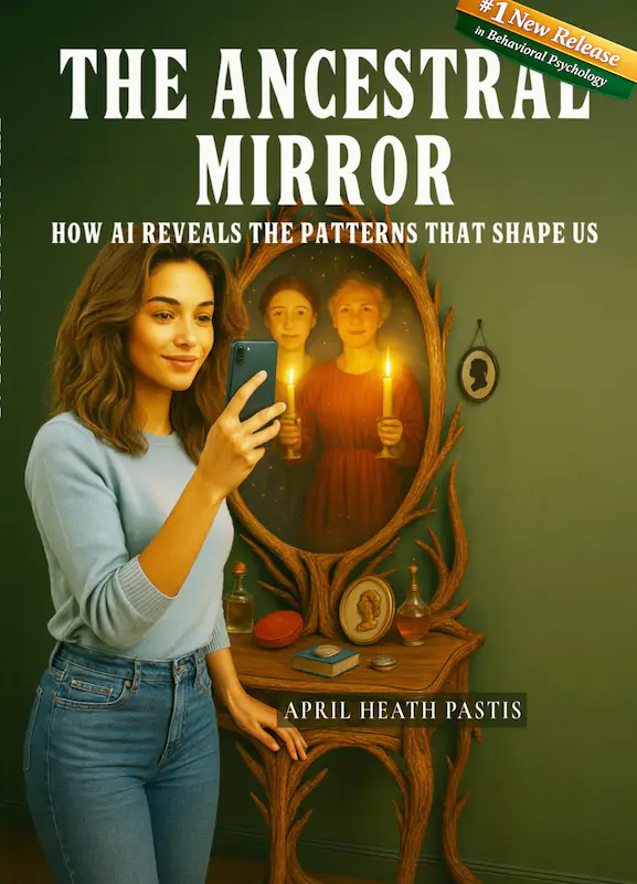
Before a reader trusts the story, they meet the shape of the book.
Long before a reader reaches the first sentence of The Ancestral Mirror, they encounter its body—its weight, its colors, its typography, its quiet promises. A book is not just a container for words; it is an experience, a threshold, a crafted object that sets the emotional temperature for everything that follows.
When I began designing The Ancestral Mirror, I knew I wasn’t just formatting pages. I was shaping an encounter. I was building a doorway into lineage work—one that felt warm, intentional, and ceremonial. And like all doorways, it needed to signal what kind of world the reader was stepping into.
This post is a behind‑the‑scenes look at how that doorway came to be: the cover, the interior, the choices, the experiments, and the quiet debates I had with myself about how to visually honor a story that is both deeply personal and universally human.
The Question That Sparked This Post
A reader recently asked me a question that made me smile: “Are the women in the mirror your actual ancestors?”
The answer is both yes and no.
On the back cover, there is a photograph of me looking into a mirror. In that mirror, you see women from my family line—my mother in the center, and around her, the women whose stories shaped mine:
- my great‑grandmother Anna Melinda Harbison,
- another grandmother, Artemese Green Sullivan,
- and a newly discovered ancestor, Julia Ann Dickerson.
I wanted them present. I wanted them visible. I wanted the reader to feel the presence of lineage—not as an abstract concept, but as a living, breathing inheritance.
But here’s the truth: in my attempt to fade them into the mirror, to make them appear as if they were emerging from memory or mist, some of their features softened so much that even I hesitate to name them all. And I know my cousins on the Heycuz newsgroup—keepers of accuracy, guardians of genealogical truth—would absolutely let me know if my artistic interpretations strayed too far from the historical record.
So yes, the images are inspired by my ancestors. And no, they are not perfect likenesses. They are artistic renderings, softened by intention, shaped by symbolism, and guided by the emotional truth of the book rather than the factual precision of archival photography.
I took artistic leeway. And I took it with love.
The Mirror as Portal: My First and Strongest Instinct
From the moment I knew the title, I knew the cover needed a mirror. But not a literal mirror. Not a decorative object. Not a piece of furniture.
I wanted the mirror to function as a portal—a threshold between past and present, between self and lineage, between what we inherit and what we choose.
A mirror is never just a reflection. It is a confrontation. A conversation. A moment of recognition. And in the context of ancestry, it becomes a bridge.
So the question became: How do you design a mirror that feels like a doorway?
This question guided every draft, every experiment, every late‑night sketch.
Idea #1: The Photo Mosaic Mirror
One of my earliest ideas was to create a mirror made entirely of tiny ancestral photographs—a mosaic of faces, documents, and fragments of the past. I even pulled out my photo mosaic app and started experimenting.
The concept was beautiful in theory: a mirror literally built from the people who came before me.
But the reality was less poetic.
Even if I could find high‑resolution images of every ancestor (and let’s be honest, most of us are working with scans of scans of scans), the final mosaic would render them so small that the viewer would see nothing but a pixelated blur. The symbolism would be lost. The emotional impact would be lost. And the cover would feel busy rather than intentional.
So I let that idea go. It taught me something, though: the cover needed clarity, not clutter.
Idea #2: The Cosmic Mirror
Another idea was to depict the mirror as a cosmic object—floating in darkness, surrounded by starlight, glowing like a celestial portal. This version framed ancestry as something larger than genealogy, something metaphysical, something that stretches beyond the boundaries of time.
I loved the mood of this concept. It felt mythic. It felt archetypal. It felt like the kind of mirror you might encounter in a dream or a ritual.
But it also felt too far from the grounded, human intimacy of the book. The Ancestral Mirror is cosmic, yes—but it is also personal. It is rooted in kitchens and family stories and the quiet ache of inherited memory. I didn’t want the cover to drift so far into the mystical that it lost its connection to the everyday.
So I set this idea aside too.
Idea #3: The Spiral Mirror
Then came the spiral.
What if the mirror didn’t reflect a straight line of ancestors, but a spiral—each turn representing a generation, each curve a pattern repeating or breaking, each ring a choice?
The protagonist would stand at the outermost edge, looking inward. Or perhaps she would stand at the center, looking outward. Either way, the spiral communicated something essential: lineage is not linear. It loops. It echoes. It circles back.
This idea stayed with me for a long time. I sketched it. I mocked it up. I played with the geometry. And while I loved the symbolism, it ultimately felt too abstract for the emotional clarity I wanted the cover to carry.
The spiral belonged inside the book, not on its face.
The Idea That Wouldn’t Leave Me Alone
Even as I explored all these concepts, one idea kept tugging at me from the background:
A woman looking into a mirror, and in that mirror, her ancestors appear—not behind her, but with her.
Supportive. Present. Witnessing.
This image felt true. It felt human. It felt like the emotional center of the book.
So I returned to it. And this time, I didn’t resist it. I let it lead.
The final cover is a blend of realism and symbolism. The mirror is both literal and metaphorical. The ancestors are both recognizable and softened. The image is both personal and universal.
It is not perfect. It is not historically precise. But it is emotionally honest. And that, to me, is the heart of the book.
Designing the Interior: The Quiet Architecture of Reading
Once the cover was settled, I turned to the interior—the part of the book most readers never consciously think about, but always feel.
Interior design is the art of shaping how a reader breathes.
I wanted the pages to feel spacious, ceremonial, and rhythmic. I wanted the reader to feel held, not rushed. I wanted the book to feel like a place where reflection is possible.
Some of the choices I made:
- Wide margins
to create a sense of openness. - A serif typeface
that feels warm and literary. - Intentional spacing
between sections to mimic the pauses we take when reflecting on our own lineage. - Subtle ornamentation
that echoes the mirror motif without overwhelming the text. - A layout that invites slow reading
, because lineage work is not something we skim.
Every choice was made with the reader’s emotional experience in mind.
Why All This Matters
Some people think design is superficial. Decorative. Secondary.
But design is meaning.
Design is the first story a reader encounters. It sets expectations. It shapes mood. It communicates values. It tells the reader, before they’ve read a single word, what kind of journey they’re about to take.
For a book like The Ancestral Mirror, which asks readers to look inward, to reflect, to consider the patterns they’ve inherited and the ones they’re choosing to break, the design needed to feel like an invitation.
A soft doorway. A gentle threshold. A mirror that doesn’t just reflect—but reveals.
In the End, the Book Became What It Needed to Be
Designing The Ancestral Mirror was not a linear process. It was a conversation—between me and my ancestors, between me and the reader, between me and the story itself.
The final book is the result of many drafts, many experiments, many moments of doubt, and many moments of clarity.
It is imperfect. It is personal. It is intentional.
And it is, I hope, a mirror that invites readers to see themselves more clearly.
0 Comments